using fonts to speak your brand
/I have always been a lover of type and found the process of selecting fonts for Belong to be a really fun process. As a non-designer, I have a few words of advice about the whole language of fonts.
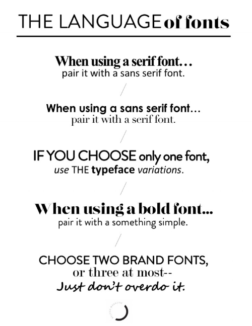
the language of fonts /
Did you know that they speak a language all their own? Who knew?! See the fonts below and tell me what you think they are saying.
AM I RIGHT?!
Fonts really do speak on a whole different level from the words they are representing and should be considered thoughtfully. Think about when someone uses ALL CAPS—it makes people feel like they are being yelled at. Or when you get a wedding invitation with beautiful, flourished script, you feel like it’s something formal and special.
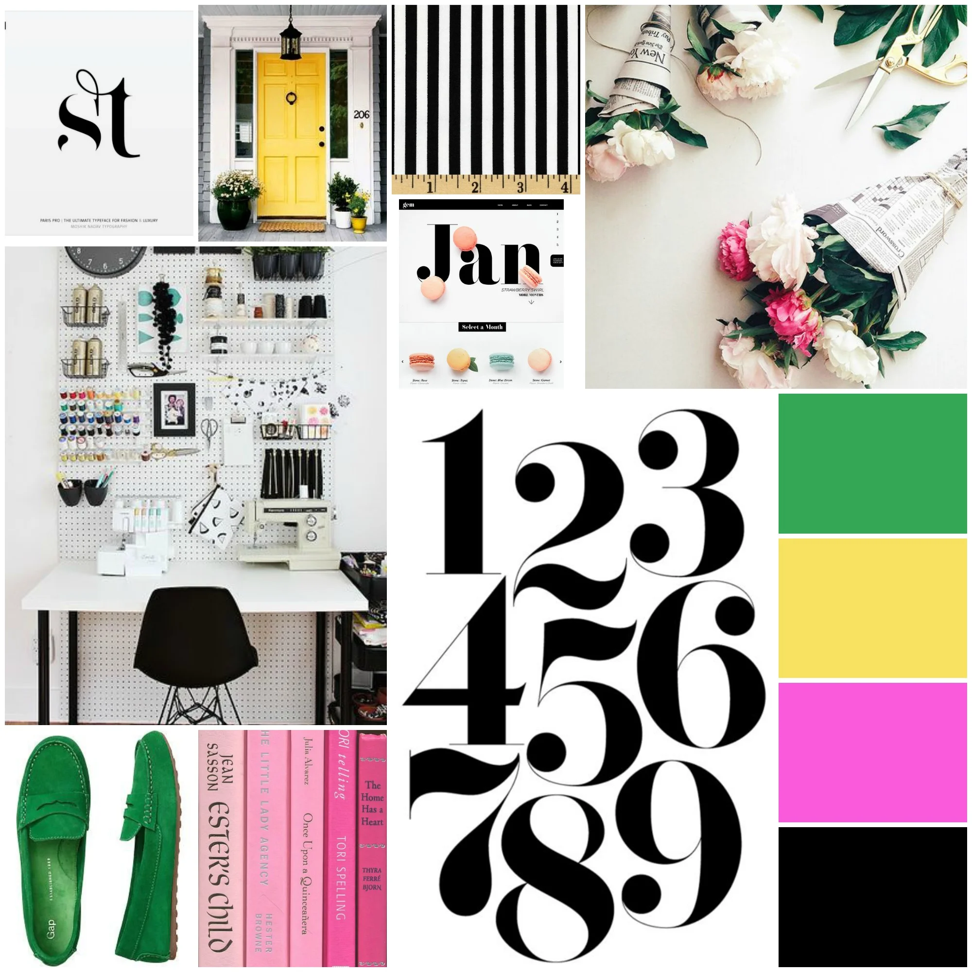
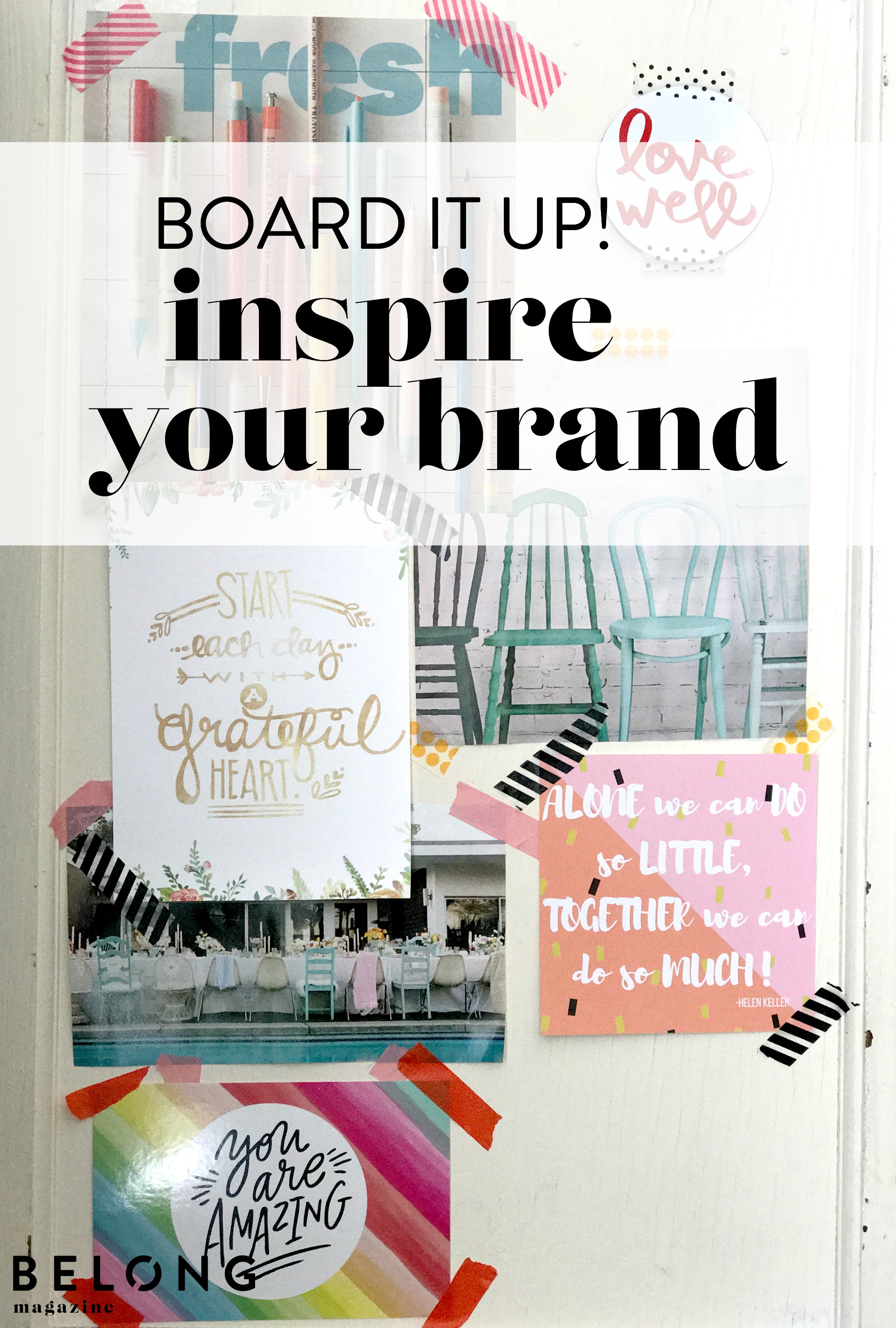
Go back to your inspiration board (if you missed that post, read it here) and see what types of fonts you see. Are they bold or light? Are they serif or sans serif (serif are the the fonts with the little do-hickies on the ends of the letters such as times new roman; sans serif are without the little do-hickies such as ariel and helvetica)? Are they simple or fancy? Keep those fonts in mind when you look for your brand’s signature font(s).
how many /
You found a font, or two, or three…how many should you actually use in your branding?! You should really stick to two fonts—generally one serif (with the extra lines at the ends of the letters—think times new roman) and one sans serif (no extra lines, think Helvetica and arial). Don’t forget that you can also use the bold and italicized versions of these fonts as well—they don’t count as additional fonts.
Are you using a fancy, handwritten font? You’ll have judge for yourself and maybe get a couple of others to weigh in on if your brand can handle THREE fonts if you are only using the fancy font occasionally.
finding the perfect font /
There are lots of fonts to choose from—both free and purchased—so you should be able to find one that suits you just right. You can even create your own! If you’re looking for a fresh font, check out these sites:
logo /
Is your font part of your logo? Maybe it IS your logo. Consider legibility and application. If there are very narrow lines in letters such as L and T, they will not be visible from a distance. If there are thick lines, they might blur together, such as a and e resembling o. And some fonts are just really difficult to read—they are too script or funky! Think about where the font will appear—in your logo, blog, newsletter, business cards, etc… to determine if it’s the right one for the job.
You want to stay consistent with your fonts across the board. It is a small thing, but can have a huge impact on the message your brand is speaking.
Does your brand have a signature font? I'd love to hear what it is! Leave me a note in the comments.


